 X078
X078 The Content Treadmill: Why Social Media Output Fails Without a Visual System
The Tyranny of the Daily Post
There is a quiet, expensive crisis occurring in marketing departments and agency floors across the globe right now. Driven by the relentless, insatiable demands of algorithms on platforms like Instagram Business and LinkedIn, companies have somehow convinced themselves that sheer volume is the only metric that matters.
The directive from the executive board to the marketing team is usually simple, brutal, and completely detached from reality: Post something every single day. Feed the beast. Stay relevant.
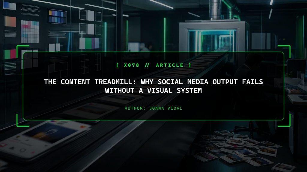
This toxic mandate creates what I call the “Content Treadmill.” The social media manager or the in-house junior designer wakes up, stares at a blank canvas, and attempts to invent a new graphical concept from scratch. They search desperately for a stock photo, they guess which font looks “cool” today, they apply a random filter they found on Pinterest, and they push it live.
The immediate, measurable consequence of this ad-hoc workflow is catastrophic team burnout. As highlighted by Sprout Social’s research on marketing burnout, forcing creatives to operate on an assembly line without proper infrastructure destroys morale.
But the secondary, far more financially damaging consequence is severe brand dilution. When you design on the fly, every single post looks slightly different. The margin shifts 5 pixels to the left. The corporate blue color suddenly looks a bit purple. The tone of voice wavers between “professional” and “desperate.” Within three short months, the company’s Instagram grid looks less like a cohesive, premium content marketing channel and more like a chaotic, schizophrenic collage of disjointed ideas. You look like an amateur.
The Financial Cost of Reinventing the Wheel
Creating content without a locked visual system is a massive, bleeding drain on operational resources. Let’s look at the math, as Harvard Business Review often reminds us to do when calculating marketing ROI.
If a highly paid designer or social media manager is spending 45 minutes every single morning deciding where to place the logo on a LinkedIn carousel, your organization is hemorrhaging money. You are paying them a salary to make micro-decisions that should have been finalized three years ago.
In high-performing, high-revenue enterprises, design decisions are not made on a daily basis. They are made exactly once, at the architectural level, and then they are weaponized at massive scale. This is the fundamental, non-negotiable purpose of social media packs.
A social media pack is not just a messy folder of generic JPEG images. It is a rigid, dictatorial, mathematically locked system. It dictates exactly how a customer quote should be formatted, how a SaaS product update should be announced, and what hex color a promotional banner must absolutely be. When you rely on a system, you mathematically guarantee that your output is instantly recognizable, premium, and flawless, regardless of whether a senior director or a first-year intern pressed “publish.”
Engineering Brand Recognition Through Constraints
Next time you are scrolling through your LinkedIn Business feed, pay close attention to your own brain. Stop scrolling when you recognize a post from a major, elite brand before you even read the author’s name. How did your neurology identify it so fast?
It was not the content of the text; you didn’t read it yet. It was the visual architecture. It was the specific, aggressive weight of the typography. It was the exact shade of the background color. It was the predictable, comforting placement of the graphical elements. This instant recognition - this muscle memory of brand trust - is physically impossible to achieve if your team is designing every post from scratch on a Tuesday morning.
As stated in the Nielsen Norman Group’s heuristics on consistency and standards, a visual system restricts freedom in order to guarantee quality. It enforces a typographic hierarchy that ensures your headlines are always highly legible on small, cracked mobile screens. It provides a locked color palette that prevents junior marketers from using off-brand gradients that destroy your aesthetic.
By actively constraining the visual variables, you force the team to stop worrying about design and focus entirely on what actually matters: the quality and conversion power of the sales message.
The Agency Workflow: Execution at Scale
Transitioning your company off the exhausting content treadmill requires a shift in mindset. You must stop treating your social media output like an art project, and start treating it like a hyper-efficient industrial production line.
At Webxtek, when we design and deploy visual systems for our high-ticket clients, we deliver the assets in a format that non-designers can use without breaking the rules. We don’t just hand over messy files. Whether the system is built natively in Figma Design Systems or an enterprise-managed Adobe Creative Cloud library, the templates are completely locked down.
The marketer cannot change the font size. They cannot move the logo. They cannot alter the padding. They can only edit the text and swap the background image. That’s it.
This surgical restriction reduces the time it takes to publish a post from 45 minutes of frustrating guesswork to exactly 4 minutes of execution. It allows companies to schedule an entire month’s worth of content in a single Tuesday afternoon. Most importantly, it guarantees that every single piece of content that leaves your building looks like it was meticulously crafted by a senior art director. In the hyper-competitive digital space, aggressive visual consistency is the ultimate flex of corporate authority.
Frequently Asked Questions
What exactly do you mean by the 'content treadmill'?
It is the exhausting, financially ruinous cycle where a company's marketing team wakes up every single day without a plan, scrambling to design and post something just to feed the algorithm. It leads to low-quality, desperate output, severe staff burnout, and a highly inconsistent, amateur brand presence.
How does a dictatorial visual system actually solve social media inconsistency?
A visual system provides pre-engineered, mathematically locked templates - what we call Social Media Packs. The typography, margins, safe zones, and color palettes are already decided by a senior designer. The marketing team only needs to drop in the daily text or photo. It surgically removes the 'design thinking' phase from the daily posting process.
Won't using strict templates make my brand's social media look robotic or boring?
No. Strict visual systems create brand authority and recognition. When your high-value audience scrolls through their feed at lightspeed, they should instantly recognize your post by the typography and color scheme before they even read your name. Consistency breeds authority and psychological trust; randomness breeds confusion and cheapness.
What software should our marketing team use to manage a rigid visual system?
While enterprise advertising agencies often use heavy tools like Adobe Creative Cloud, the most efficient, cost-effective workflow for daily corporate output relies on strict templates built natively in Figma. Figma allows you to lock the UI components so non-designers can publish perfectly branded content without breaking the architectural rules.
[ RELATED_NODES ]
> START_PROJECT
Need a website that earns trust, ranks in search, and gives your business a stronger digital presence? Start the conversation here.